FlexboxLayout
FlexboxLayout is a flexible box layout that arranges its children in rows or columns with automatic wrapping. It implements a CSS Flexbox-like layout model suitable for creating flexible, responsive UIs.
Note:
FlexboxLayoutis experimental and subject to change. Tracking issue: slint-ui/slint#66 ↗.
// This example demonstrates FlexboxLayout with row direction (default)export component Foo inherits Window { width: 300px; height: 200px; FlexboxLayout { spacing: 8px; padding: 8px; flex-direction: row; Rectangle { background: red; width: 60px; height: 50px; } Rectangle { background: blue; width: 60px; height: 50px; } Rectangle { background: yellow; width: 60px; height: 50px; } Rectangle { background: green; width: 60px; height: 50px; } Rectangle { background: purple; width: 60px; height: 50px; } }}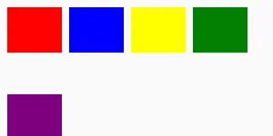
// This example demonstrates FlexboxLayout with column directionexport component Foo inherits Window { width: 300px; height: 300px; FlexboxLayout { spacing: 8px; padding: 8px; flex-direction: column; Rectangle { background: red; width: 50px; height: 60px; } Rectangle { background: blue; width: 50px; height: 60px; } Rectangle { background: yellow; width: 50px; height: 60px; } Rectangle { background: green; width: 50px; height: 60px; } Rectangle { background: purple; width: 50px; height: 60px; } }}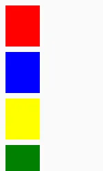
Overview
Section titled “Overview”In row direction, items are placed from left to right. When the available width is exceeded, items automatically wrap to the next row. In column direction, items are placed from top to bottom and wrap to the next column when the available height is exceeded.
Spacing Properties
Section titled “Spacing Properties”spacing
Section titled “spacing” length default: 0px
The distance between the elements in the layout. CSS Flexbox usually calls this “gap”, but “spacing” is used in Slint for consistency with other layout types. This single value is applied as both horizontal and vertical spacing between items.
To target specific directions with different values use the following properties:
spacing-horizontal
Section titled “spacing-horizontal” length default: 0px
The horizontal distance between items in the layout. CSS Flexbox calls this “column-gap”.
spacing-vertical
Section titled “spacing-vertical” length default: 0px
The vertical distance between items in the layout. CSS Flexbox calls this “row-gap”.
Padding Properties
Section titled “Padding Properties”padding
Section titled “padding” length default: 0px
The padding around the layout as a whole. This single value is applied to all sides.
To target specific sides with different values use the following properties:
padding-left
Section titled “padding-left” length default: 0px
padding-right
Section titled “padding-right” length default: 0px
padding-top
Section titled “padding-top” length default: 0px
padding-bottom
Section titled “padding-bottom” length default: 0px
Alignment Properties
Section titled “Alignment Properties”alignment
Section titled “alignment” enum LayoutAlignment default: the first enum value
Set the alignment of items along the main axis. CSS Flexbox calls this “justify-content”.
Note that the stretch value has no effect on FlexboxLayout (main-axis stretching in CSS Flexbox is controlled by flex-grow).
Direction Properties
Section titled “Direction Properties”flex-direction
Section titled “flex-direction” enum FlexboxLayoutDirection default: the first enum value
The primary direction in which items are placed. Set to row to place items horizontally left-to-right (default), or column to place items vertically top-to-bottom.
It also supports row-reverse and column-reverse which invert the flow: row-reverse places items right-to-left (starting at the right edge), and column-reverse places items bottom-to-top (starting at the bottom edge).
flex-wrap
Section titled “flex-wrap” enum FlexboxLayoutWrap default: the first enum value
Controls whether flex items wrap onto multiple lines when they don’t fit in the container.
The default value is wrap.
align-content
Section titled “align-content” enum FlexboxLayoutAlignContent default: the first enum value
Set the distribution of flex lines along the cross axis.
The default value is stretch.
align-items
Section titled “align-items” enum LayoutAlignItems default: the first enum value
Set the alignment of individual items along the cross axis within each flex line.
The default value is stretch.
Per-Item Properties
Section titled “Per-Item Properties”The following properties can be set on individual children of a FlexboxLayout:
flex-grow
Section titled “flex-grow” float default: 0.0
Controls how much an item grows relative to other flex items when there is extra space along the main axis.
A value of 0 (default) means the item does not grow. Items with higher values receive proportionally more extra space.
flex-shrink
Section titled “flex-shrink” float default: 0.0
Controls how much an item shrinks relative to other flex items when items overflow the container along the main axis.
Default is 1 (matching CSS behavior). A value of 0 means the item does not shrink. Items with higher values shrink proportionally more.
flex-basis
Section titled “flex-basis” length default: 0px
Sets the initial main size of a flex item before growing or shrinking is applied.
If not set, the item’s preferred-width (row) or preferred-height (column) is used.
flex-align-self
Section titled “flex-align-self” enum FlexboxLayoutAlignSelf default: the first enum value
Overrides the container’s align-items for this specific item.
The default value is auto, which inherits the container’s align-items setting.
flex-order
Section titled “flex-order” int default: 0
Controls the visual order of flex items. Items with lower values appear first.
Items with the same order value preserve their declaration order.
The default value is 0.
Layout Behavior
Section titled “Layout Behavior”The layouting algorithm for FlexboxLayout is entirely implemented by taffy
You can learn more about the CSS Flexbox specification from
- the Mozilla developer website
- A Complete Guide To Flexbox by CSS Tricks. This is detailed guide with illustrations and comprehensive written explanation of the different Flexbox properties and how they work.
© 2026 SixtyFPS GmbH